[no. 010] imagehaus.net
I recently came across the website for imagehaus.net, which is a design company in Minneapolis, Minnesota. Their client list includes 3M, Target, and some others that I do not readily recognize. The website describes themselves as having "escaped the big agency environment and created an intimate design firm with all the creative and strategic power of the big boys, but without the processes, layers and three-hour meetings. Our HAUS is a close-knit group of designers, writers and strategic planners who focus exclusively on strategy+design+production. We use this power for our client's good, creating everything from brand names, identity systems and point of sale promotions to catalogs, packaging and advertising."
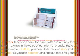
After you enter their website, there is a pop-up window that has colored vertical bars that function as links to some examples of their work. I chose the following because they are among my favorite from this design firm. I am drawn to the use of the natural color palette, it harmonizes with the choice of paper they print on. The design elements are very subtle and minimalistic. I also like how in the PAGODA identity system, the designer used embossing/debossing to create inkless words. It also adds a tactile level to an otherwise flat appearance. In the SCMIDTY’s identity system, on the business cards on the right-hand side, the top corners are rounded, it is something small, but still sets it apart from every other rectangular business cards that you usually see.


These next ones also caught my eye because of their very clean design and bright-whiteness. The paper itself is very bright, but paired with the bold colors, then the design seems to pop. The geometric shapes in the Wilsons Leather gift cards reveal a grid system within. Also, the roundness relates to the type choice which is also round in form.


At the bottom of the pop-up window is a “navigation paragraph”—a paragraph that has words that are hyperlinks. The intro for each linked page feels like we’re being shown glimpses of their little haus, just hints that fade in and out.


3 Comments:
hi little courtney :) I really liked the PAGODA identity system and the Larson Glastron boat company business card. The design for the Pagoda spa was very appropriate for the company's attitude. The designers' use of simple and clean typography, calm earthy colors, and especially the embossing/debossing to create inkless words, really gave a feeling of relaxing, cleansing, calming, simplicity, exclusive, etc.
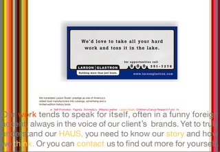
As for the Larson Glastron boat company business card, the part that I really liked was the litttle wave pattern that goes in between the 800. I dont know why i like it so much, but without the little waves i dont think this business card would be much interesting at all. These three little waves really pull the whole design together, and serve as just enough to turn a boring design into a subtlely beautiful design.
12:40 AM
This comment has been removed by a blog administrator.
12:40 AM
Imagehaus website I find to be very compelling in the navigation of the site, especially the work (portfolio). Because the color bars allow you to navigate the work that is produced by this design haus. Also the typographical information that is in constant rotation in the "work" of the site provides the viewer with the ability to to group the portfolio by company. I like this minimal clean use of space, it feels more designed then other sites I have seen.
I like how the text is actually links to the pages in the website through the words in particular that allow you to navigate. Their use of bold colors in type is experimental, because of the fact that on some of the pages the type visually vibrates through the use of red and grey. But over all really nicely and professionally done.
2:57 PM
Post a Comment
<< Home