[no. 009] CD Design
When I took 201 (Expanded Arts) during a summer session with Thomas Wasson, and we had to create packaging designs for the CDs that we submitted our projects on, I did research on different kinds of CD designs there are. When I went to the Library, I borrowed a book that I just absolutely love, and I have recently acquired it for my own collection, it is called CD-ART: Innovation in CD Packaging Design.
The main aim of such innovative design involves really breaking out of the typical jewel cases that are mainstream music-industry’s standard. There are logical reasons to have a jewel case, for instance, it allows for a uniform storage system on store shelves and at home. However, these designs are predominantly not for mass-commercial purposes. I really like how each design has a short description of the project, what decisions were made and what they were motivated by, and the types of materials that were used.

There are so many designs that just amaze me, but if I had just pick a couple, here they are:
The first CD packaging was used for a catwalk show opening. The materials used were clear acrylic that has been etched into, accompanied by the black CD itself, both lend themselves to the air of glamour that a fashion show exudes. The two pieces that sandwich the CD are comprised of a male and female disc that screw into each other. As the designer points out, “This elevates the CD to coffee table display item as opposed to providing another CD to be put in the collection.”
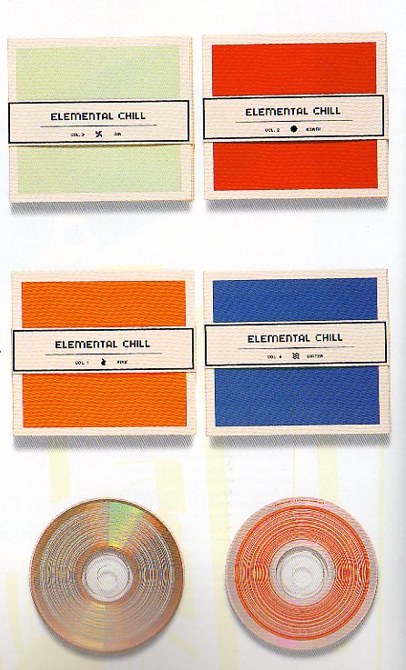
The second design is based on the idea of the four elements: fire, earth, water, and air. There are four CDs in this series, and each on has its own logo and color, but together have a unified format. A belly-band was used to close the minimalist packaging. The only thing that hindered their minimalist design was that retailers required a barcode to be placed on the packaging, but the designer felt that would spoil the design. In order to overcome this hurdle, they designed the seemingly innocuous concentric circles that are on the CDs themselves. These serve as barcodes that can be read by any store barcode reader, but also as a design element that still conforms to their minimalist design.

The final design is for Frou Frou, an electric pop band. “Once the PVC slipcase is removed the viewer is faced with two sheets of plastic. The first is a blank sheet with the instructions ‘breathe on’ in the corner. Warm breath makes heat-sensitive ink letters visible, forming lyrics from the album. The second sheet is visibly printed with lyrics but these need to be read through the enclosed eyeglasses.”
Ultimately, this book really inspired me toward the packaging aspect of design. I love creating things with my hands, having the tactile feeling really makes me feel like I am creating something. I enjoy not only thinking about the art of the packaging, but I really do like to think through the process of what the experience of opening up the packaging will be like and interacting with it too. I hope that in the future, I will be able to produce such innovative designs as ones that are published in this book.
posted by Courtney at 3/04/2006 03:29:00 AM
![]()


3 Comments:
I really like the final design Frou Frou because of the heat sensitive type that becomes visable only when activated by the viewer. That is really a innovative way of presenting the lyrical aspect of the music. I find the more interesting the package design the more I want to buy it, and isn't that just it, the more original the more likely that the consumer will buy it. I like the first cd packaging too, because of its unusual concept of the male and female that screw together to create a whole case, its like the poet and his muse. It also feels vintage at the same time, industrial.
12:33 AM
Im also currently taking Thomas Wasson's 201 class right now. Thomas challenged us to make a CD that consisted of sound art along with a CD case that served as an art piece by itself. He told us to think about it as if the CD case was a sculpture. We can use any materials that we want just as long as it hold a CD and is appropriate to your project. I thought that this was such an interesting way to approach a CD case design.
The CD cases in your blog remind me of the type of CD cases that Thomas wants us to strive to create. I especially liked the last CD case by Frou Frou. How did someone think to use ink that is activated by the heat of your breath?? Its a technique that I have never seen on a CD case before, and I think it really adds to the feel and content of the CD. I also found it very clever of the second CD designer to solve his problem by incorporating the barcode directly onto the CD itself.
4:32 PM
I love the first packaging!
I have a giveaway on my blog. I would love it if you could please check it out. Link to giveaway here!
:)
3:26 PM
Post a Comment
<< Home