[no. 002] Radical Type Design /chapter 4/visual poetry
I recently received two out of the three assigned books for this past winter break, Radical Type Design and Visual Research. I was looking through the former, and came across some interesting type designs in the fourth chapter of the book, Visual Poetry.
First of all,

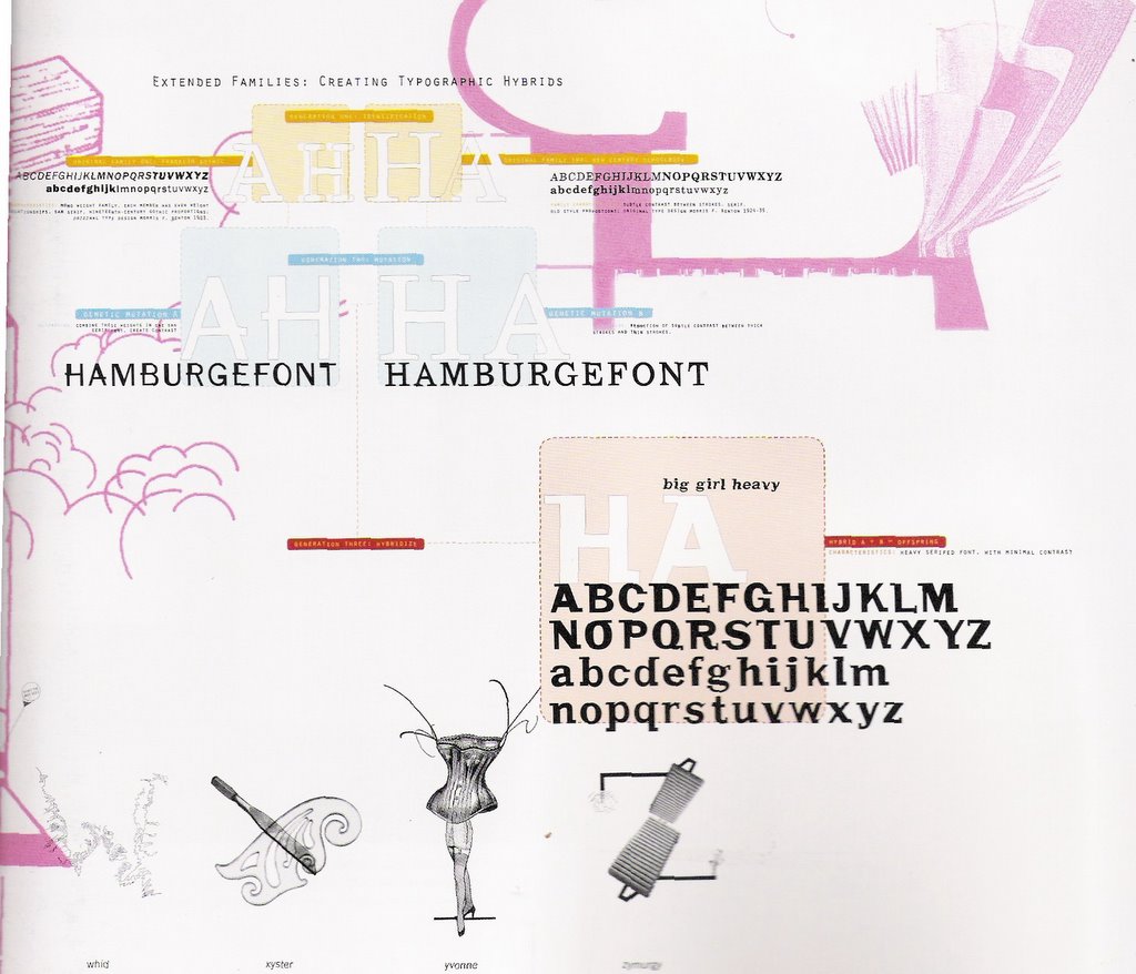 I found Susan Laporte’s design to be of interest because of the method she employed for her “Extended Families: Creating Typographic Hybrids”project in which she used the format of a family tree and filled it with two typefaces to create a third, the hybrid. This section describes Laporte’s three-step formula: generation one: identification; generation two: mutation; and generation three: hybridize. Not only was this a creative method of creating a new typeface, but I thought it was wonderful that she did so by hand, not just by plopping two typefaces of interest into a computer program and have it done automatically. By having it done by hand shows that there was particular care and concern given to the nuances of the parent typefaces in order to conceive of the child typeface.
Secondly, I was interested by the geometric essence of Ahn Sang-Soo’s work. The first piece of work that caught my
 attention was the photograph of a gate, which is Sang-Soo’s, that is entirely filled with letterforms. I suppose I was initially drawn to the geometric forms that reminded me of Futura’s letterforms, but I now recognize that it is actually Korean characters that compose this gated wonder. It is actually quite amazing that a well-known typeface that was invented in America can seem to have such similar visual characteristics to that of another language. Perhaps the visual languages that people from various nations communicate by are more similar than they are different. As a side note, I would also like to add that it was refreshing to see typography that has jumped off the two-dimensional page and into the three-dimensional world that we can physically interact with.
posted by Courtney at 1/16/2006 07:25:00 PM
![]()


2 Comments:
I think it very interesting to remix typography i.e.. two fonts, to take the essence of one and combined it within another hence a hybrid a + b = something in between its "genius" or a monster which would be the Friekenstein of typography. I would like to experiment with this idea definitely this semester a little, if my books ever come? Maybe I should start soon on this idea and possibly post my results and get feed back, it would be like being in class and getting critiqued, pretty interesting idea, "huh".
10:31 PM
Susan Laporte had a very interesting approach to creating her hybrid typeface. Her three steps to create her hybrid typeface and her use of the family tree idea make it clear for the viewer to understand how she arrived at her hybrid typeface. I also like her use of small detail and delicate lines and patterns, which add to the scientific feeling of her "crossbreeding" idea. I also thought it was really cute (is it ok to say cute?) how she named her hybrid typeface "big girl heavy." It describes the typeface well.
When I first looked at Ahn Sang-Soo's gate, I could tell that it had Asian qualities, but I did not realize that it was made from Korean letterforms, even though I know how Korean letterforms look. It was interesting to see that Korean letters are composed of only a few simple shapes.
10:50 PM
Post a Comment
<< Home