[no. 005] typography 25/ Corporate Identity
I have always been drawn by corporate identity works. I suppose it is because it is the beauty of creating a body of work with various applications while still retaining a single identity that fascinates me. While I was looking in the Typography 25 annual, I came across some corporate identity pieces that I found of interest.
The first one is for a company called Foto Motel Rent Studio that is shown on page 46. The style of the design is like an old-fashioned real estate ad, it gives off a vintage feeling. To me, the aim of this is to evoke memories of a simpler time, a nostalgic time. After the viewer gets an overall feeling and is able to read further into the stationary and postcards, one can see that they have covertly composed photos of their real, modern-looking studio into the rest of the composition. These two settings, one classical, one modern, are juxtaposed into one large composition. Beyond the content of the identity project, I felt that the overall design was well done. The designer, Robert Neumann, used elements from the main photography into the rest of the other pieces. For example, the “Foto Motel” sign that is highly visible on the front of the postcards and business cards is used as a logo on the letterhead, as well as being the largest element on the flip sides of the cards. I think it is interesting how Neumann mixed up the placement of information on the letterhead. Usually, we are accustomed to seeing all the contact information at the very top, however, Neumann drops it down to the very bottom, in the lower right corner.

--------------------------------------------------------------------------------------------------------------
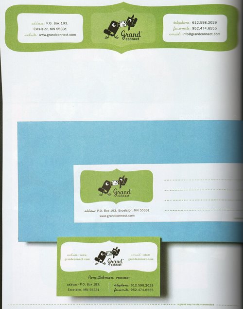
Another identity project that I found of interest is on page 48, which showcases the company Grand Connect. This is a very simplistic design of two birds that are holding an envelope between them with their beaks. The use of curves in the oblong, irregular shape softens the feeling of this company. The use of a cursive typeface and the childlike birds also help this company come off as non-threatening and nurturing. I am led to believe that this company’s target audience is mainly women. Women are generally more sensitive to these small details and would appreciate a delicate design such as this. Overall, I think this project was articulated well and comes off as a solid, coherent piece of a single identity.
posted by Courtney at 2/06/2006 10:51:00 PM
![]()


4 Comments:
I also enjoy looking at corporate identity pieces. I like how you said, "it is the beauty of creating a body of work with various applications while still retaining a single identity that fascinates me." That is exactly the same way I feel about it. Its not necessary to put the exact same design on the stationary, business cards, postcards, etc in order to make them seem unified. It is the designer's responsibility to create variety while not breaking the unity.
The second corporate identity works was appealing to me. It caught my attention regardless of what the company was about. The colors and design felt pleasant and inviting. Design is extremely important in these cases because if the design is not attractive, then viewers will most likely not even stop to read what the company has to say in the first place.
5:07 PM
This comment has been removed by a blog administrator.
5:07 PM
"Foto motel", what a neat spin off of a old vintage style ad that were not accustomed to seeing. I am still trying to understand the idea of foto motel why "foto" and not something else, maybe because he has illustrations of photos on the front his cards. The typography shows a good sense of hierarchy in the digestion of information.
Grand connect , I really like the illustrations of the birds as the company logo. I find that the birds tails seem to mimc the curling of paper. And the two birds holding a envelope which I think means the ability to communicate in society as a whole.
10:57 PM
This comment has been removed by a blog administrator.
10:57 PM
Post a Comment
<< Home