Monday, March 13, 2006

[no. 010] imagehaus.net

I recently came across the website for imagehaus.net, which is a design company in Minneapolis, Minnesota. Their client list includes 3M, Target, and some others that I do not readily recognize. The website describes themselves as having "escaped the big agency environment and created an intimate design firm with all the creative and strategic power of the big boys, but without the processes, layers and three-hour meetings. Our HAUS is a close-knit group of designers, writers and strategic planners who focus exclusively on strategy+design+production. We use this power for our client's good, creating everything from brand names, identity systems and point of sale promotions to catalogs, packaging and advertising."

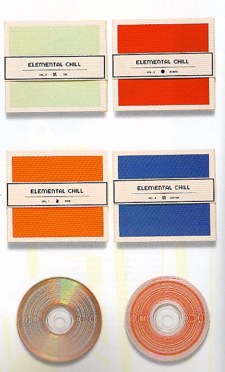
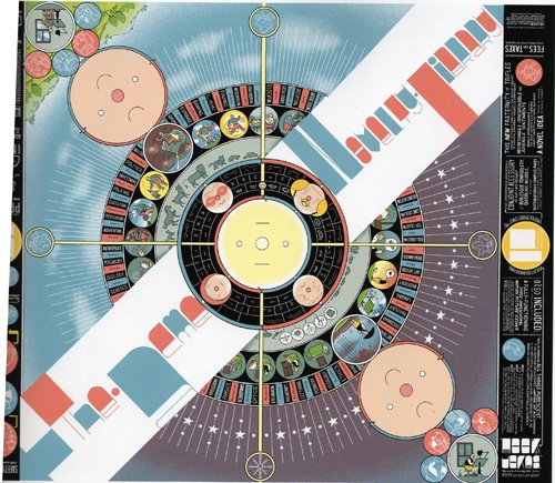
After you enter their website, there is a pop-up window that has colored vertical bars that function as links to some examples of their work. I chose the following because they are among my favorite from this design firm. I am drawn to the use of the natural color palette, it harmonizes with the choice of paper they print on. The design elements are very subtle and minimalistic. I also like how in the PAGODA identity system, the designer used embossing/debossing to create inkless words. It also adds a tactile level to an otherwise flat appearance. In the SCMIDTY’s identity system, on the business cards on the right-hand side, the top corners are rounded, it is something small, but still sets it apart from every other rectangular business cards that you usually see.


These next ones also caught my eye because of their very clean design and bright-whiteness. The paper itself is very bright, but paired with the bold colors, then the design seems to pop. The geometric shapes in the Wilsons Leather gift cards reveal a grid system within. Also, the roundness relates to the type choice which is also round in form.


At the bottom of the pop-up window is a “navigation paragraph”—a paragraph that has words that are hyperlinks. The intro for each linked page feels like we’re being shown glimpses of their little haus, just hints that fade in and out.

Saturday, March 04, 2006

[no. 009] CD Design

When I took 201 (Expanded Arts) during a summer session with Thomas Wasson, and we had to create packaging designs for the CDs that we submitted our projects on, I did research on different kinds of CD designs there are. When I went to the Library, I borrowed a book that I just absolutely love, and I have recently acquired it for my own collection, it is called CD-ART: Innovation in CD Packaging Design.

The main aim of such innovative design involves really breaking out of the typical jewel cases that are mainstream music-industry’s standard. There are logical reasons to have a jewel case, for instance, it allows for a uniform storage system on store shelves and at home. However, these designs are predominantly not for mass-commercial purposes. I really like how each design has a short description of the project, what decisions were made and what they were motivated by, and the types of materials that were used.

There are so many designs that just amaze me, but if I had just pick a couple, here they are:

The first CD packaging was used for a catwalk show opening. The materials used were clear acrylic that has been etched into, accompanied by the black CD itself, both lend themselves to the air of glamour that a fashion show exudes. The two pieces that sandwich the CD are comprised of a male and female disc that screw into each other. As the designer points out, “This elevates the CD to coffee table display item as opposed to providing another CD to be put in the collection.”


The second design is based on the idea of the four elements: fire, earth, water, and air. There are four CDs in this series, and each on has its own logo and color, but together have a unified format. A belly-band was used to close the minimalist packaging. The only thing that hindered their minimalist design was that retailers required a barcode to be placed on the packaging, but the designer felt that would spoil the design. In order to overcome this hurdle, they designed the seemingly innocuous concentric circles that are on the CDs themselves. These serve as barcodes that can be read by any store barcode reader, but also as a design element that still conforms to their minimalist design.


The final design is for Frou Frou, an electric pop band. “Once the PVC slipcase is removed the viewer is faced with two sheets of plastic. The first is a blank sheet with the instructions ‘breathe on’ in the corner. Warm breath makes heat-sensitive ink letters visible, forming lyrics from the album. The second sheet is visibly printed with lyrics but these need to be read through the enclosed eyeglasses.”

Ultimately, this book really inspired me toward the packaging aspect of design. I love creating things with my hands, having the tactile feeling really makes me feel like I am creating something. I enjoy not only thinking about the art of the packaging, but I really do like to think through the process of what the experience of opening up the packaging will be like and interacting with it too. I hope that in the future, I will be able to produce such innovative designs as ones that are published in this book.

Monday, February 27, 2006

[no. 008] passage of time

In my own work, for some unaccounted unconscious reason, I usually do not show a passage of time. I usually just have an absolute point and time that I am trying to convey to the viewer. This point became more apparent to me as I was looking at some works that do in fact show a progression in the work through time.


Scrolls are a part of traditional Chinese culture which unroll to reveal a story, history, or painting. With the invention of books, scrolls seem to have been phased out for a more practical solution. However, designer Alan Chan used the scroll technique to produce his “retrospective exhibition, ‘Alan Chan: The Art of Living’ at the Hong Kong Heritage Museum.” In his scroll, Chan shows his life works- “a paper brain full of thoughts, art, ideas, and memories.” When we were working on our Haiku books at the end of last semester with Lee, we were told to think about the pacing of our books, allow the narrative to reveal itself throughout the pages. In a project such as this, pacing is a very important design consideration. Since this scroll is 34.5 meters long, there is no way to present all the information at once, Chan had to select the images and type that would flow smoothly as one unrolled the scroll. There is a lovely and gradual process that we see in this scroll. Contemporary design placed in a format that harks back to a traditional art.


Jae-Hyouk Sung and Matthew Normand designed a series of posters for the California Institute of Arts for its Lecture Series. However, the two designers were not given a complete list of the lecturers they were expecting. In order to work around this hurdle, Jae-Hyouk and Matt decided that they would print X-amount of posters and then each new lecturer’s information would be silk screen printed over the poster for the previous one. The designers linked the choice of type and subsequent cross-out elements to each layer of silk screening in order to bring forth all the information pertinent to that layer. For instance, the “series 3” poster has X marks that are used to cross out the information from “series 2.” There is an interesting quality to the density of each subsequent poster, there is obviously more physical ink that is put down, but in addition, it creates a pattern and added complexity to each piece as if each series is building toward a climax. In addition to carefully considering the type, color, and compositional choices, the designers considered the orientation of each as the lecture series progressed. “The posters shift between a vertical and horizontal format in a clockwise direction to indicate time.” I found this to be a thoughtful aspect of the whole series of posters that is just what it needed to be a cohesive set.

Monday, February 20, 2006

[no. 007] Grip Design (www.gripdesign.com)

Everyone has their own types of design elements that they are attracted to, perhaps bright colors, overlapping layers of information, an ethereal feeling, and so on. Of course, depending on what the context of the work is operating in determines certain types of attractiveness as well. For me, I am attracted to clean cut design that is not cluttered with unnecessary elements. When I was going through a HOW magazine from last year, there was a particular website that drew my attention and I have had it in the back of my mind ever since. It is a design company called Grip Design, and their website is www.gripdesign.com


What attracts me to their website is the muted, natural colors that harmonize together on the page. It is not necessary to have so many bright and flashy colors to draw attention and keep it. If one can select the right colors to create a pleasing color palette, then that is what’s really important. Also, I appreciate how the web designer did not just stick to the angular, sharp cornered blocks of color we are so accustomed to seeing in amateur web design. Of course, this page was created in Flash, so that accounts for the freedom of form, but it still reflected in the small elements of the page- such as the customized scroll bars within the page content, the graphic buttons that serve as links, and the sensitivity to type selection, all of which are not your standard web elements. Underlined links, gray form buttons and default web fonts could have functioned just the same, but it just wouldn’t be as pleasing to the eye nor would it appeal to or reflect good design sensibility.

As far as user friendliness, the navigation system is not all organized in one place, like a navigation bar or a single drop down menu, instead the web designer decided to allow the user to use his intuition to follow a button, then a drop-down menu, then different types of buttons. At first one may construe this as confusing, but really, it engages the user to really explore the whole webpage, it exposes the user to all types of links, not just words that are underlined.

Within the page, a user can follow links to view the company’s portfolio which spans a multitude of media from web to identity to packaging and more. All of which reflect the company’s sensitivity to an unobtrusive type of design. It is not all flashy, but takes on a more sophisticated sensibility. All of the design lives harmoniously together, whether it be in print or electronic.

However, I am a little concerned that perhaps this type of design may be too “safe?” Maybe it does not take enough risks? That is what I am always worried about in my own design as well. I try to placate the design but that often results in being boring and too safe—something that works, but that we’ve already seen.

Sunday, February 12, 2006

[no. 006] Street Logos

Over the Winter Break I bought a book called Street Logos by Tristan Manco. It is about how traditional graffiti like tagging, has been transformed into an art form with a free-for-all kind of attitude. “Spontaneous doodles have run riot as sketchbooks are swapped for street corners.”

One category of street art is signs. Originally, graffiti artists were making statements by painting over the signs of the city, in an effort to reclaim the city space that has been conquered by consumerist advertising. However, in more recent years, graffiti artists have been using the aesthetics of signage to create their own marks, as such aesthetics “represent order, authority, consumer culture and the way our lives are regulated.”

Iconographics is another category of street art. Manco makes the argument that “people have become immune to tagging, so when an artist starts using an image instead we suddenly take notice. This is very true, we are so accustomed to seeing some name or word tagged on a wall, that it hardly turns our head, but when we see an image of something drawn onto a wall, it grabs our attention, even if just for a second.

There are a few artists’ works which I thought were of particular interest such as Pixel Phil whose style is to mimic the pixilated figures we might see on a computer screen. He uses these figures to make jokes, juxtaposing these digital figures with reality. He considers the location before he creates his characters. I think that we often get caught up in the drama of life, and sometimes don’t have the time or effort to see the brighter side of it. But Pixel Phil creates these visual parodies that are carefully thought out to deliver a humorous message without too much thinking involved. Another iconographic artist that I found to be interesting was Plug. He paints the European standard two-pin plug onto “machines or objects on the street so that they can look unplugged, symbolizing the shutting down of the system.”


All these artists are making statements, whether they be personal or political. Graffiti is a channel that they are using because it is very public and there are so many statements that can be made about our society on the very streets that we see on an everyday basis. Further, these artists are not just taking images from their imagination or otherwise, and plopping them anywhere they please, they have taken consideration into the form of their images and how they can be integrated into their environment, creating some narrative or commentary about existing conditions.

Monday, February 06, 2006

[no. 005] typography 25/ Corporate Identity

I have always been drawn by corporate identity works. I suppose it is because it is the beauty of creating a body of work with various applications while still retaining a single identity that fascinates me. While I was looking in the Typography 25 annual, I came across some corporate identity pieces that I found of interest.

The first one is for a company called Foto Motel Rent Studio that is shown on page 46. The style of the design is like an old-fashioned real estate ad, it gives off a vintage feeling. To me, the aim of this is to evoke memories of a simpler time, a nostalgic time. After the viewer gets an overall feeling and is able to read further into the stationary and postcards, one can see that they have covertly composed photos of their real, modern-looking studio into the rest of the composition. These two settings, one classical, one modern, are juxtaposed into one large composition. Beyond the content of the identity project, I felt that the overall design was well done. The designer, Robert Neumann, used elements from the main photography into the rest of the other pieces. For example, the “Foto Motel” sign that is highly visible on the front of the postcards and business cards is used as a logo on the letterhead, as well as being the largest element on the flip sides of the cards. I think it is interesting how Neumann mixed up the placement of information on the letterhead. Usually, we are accustomed to seeing all the contact information at the very top, however, Neumann drops it down to the very bottom, in the lower right corner.


--------------------------------------------------------------------------------------------------------------

Another identity project that I found of interest is on page 48, which showcases the company Grand Connect. This is a very simplistic design of two birds that are holding an envelope between them with their beaks. The use of curves in the oblong, irregular shape softens the feeling of this company. The use of a cursive typeface and the childlike birds also help this company come off as non-threatening and nurturing. I am led to believe that this company’s target audience is mainly women. Women are generally more sensitive to these small details and would appreciate a delicate design such as this. Overall, I think this project was articulated well and comes off as a solid, coherent piece of a single identity.

Monday, January 30, 2006

[no. 004] Area / pg. 380- 383/ Chris Ware


First of all, the book Area, published by Phaidon, is a very big book that is filled with lots of interesting design work. Chris Ware, from Chicago, has some visually appealing work in this book. Chris is actually a comic artist who “obsesses over unrepentantly luscious forms.” His illustrations are very geometric in form and cartoon-like in color. What particularly appeals to me is his use of space and scale. He utilizes the entire page to paint a well-designed canvas of lines, shapes, and typography. Especially in his “The Comics Journal” poster, the artwork, which we are able to discern without much effort, is very two-dimensional. However, the manner in which he places the typography over the drawn figures, with the smaller type below, makes this piece be perceived as if there is more than just one plane in space that each element is resting on. Not only that, but in the margins of the poster, there are very simple, yet eye-catching series of lines and circles that recede towards the title of the piece, moving our interest around the page from drawn figures to type to lines again.

In Ware’s “Building Story” and “Branford the Bee” comic strips, he makes use of scale to change up the expected squares of identical size that are typically used in comics. This method makes the comics seem more diagrammatic and dynamic than most other comic strips. In his “Building Story” strip, I like how the diagram like elements, like the connecting lines, close-ups, and icons relate to its content of building and breaking down a certain process.


There is a certain quality to “The Acme Novelty Library” cover that reminds me of a record album cover. I think it is the radial shape that is created with the circles placed on a central axis point that first establishes this. But moreover, it is the compass-like crossbars, dial-like tick marks, roulette table compartments, and generally circular forms that emphasize this too. As a contrast to the colorful, complex center art, the margins of the cover are very simplified and monochromatic.


I like how Chris Ware is very aware of how he is using the spacial elements in his works, contrasting styles within the same piece to create visual interest. There are multiple levels to read into his work that make it something you have to look at closer and closer, pulling you into his comic world.