[no. 004] Area / pg. 380- 383/ Chris Ware
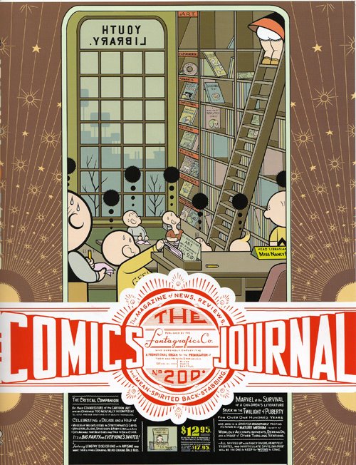
First of all, the book Area, published by Phaidon, is a very big book that is filled with lots of interesting design work. Chris Ware, from Chicago, has some visually appealing work in this book. Chris is actually a comic artist who “obsesses over unrepentantly luscious forms.” His illustrations are very geometric in form and cartoon-like in color. What particularly appeals to me is his use of space and scale. He utilizes the entire page to paint a well-designed canvas of lines, shapes, and typography. Especially in his “The Comics Journal” poster, the artwork, which we are able to discern without much effort, is very two-dimensional. However, the manner in which he places the typography over the drawn figures, with the smaller type below, makes this piece be perceived as if there is more than just one plane in space that each element is resting on. Not only that, but in the margins of the poster,
 there are very simple, yet eye-catching series of lines and circles that recede towards the title of the piece, moving our interest around the page from drawn figures to type to lines again.
In Ware’s “Building Story” and “Branford the Bee” comic strips, he makes use of scale to change up the expected squares of identical size that are typically used in comics. This method makes the comics seem more diagrammatic and dynamic than most other comic strips. In his “Building Story” strip, I like how the diagram like elements, like the connecting lines, close-ups, and icons relate to its content of building and breaking down a certain process.
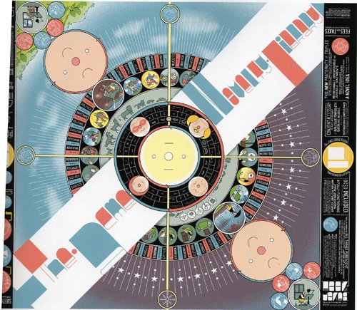
There is a certain quality to “The Acme Novelty Library” cover that reminds me of a record album cover. I think it is the radial shape that is created with the circles placed on a central axis point that first establishes this. But moreover, it is the compass-like crossbars, dial-like tick marks, roulette table compartments, and generally circular forms that emphasize this too. As a contrast to the colorful, complex center art, the margins of the cover are very simplified and monochromatic.
I like how Chris Ware is very aware of how he is using the spacial elements in his works, contrasting styles within the same piece to create visual interest. There are multiple levels to read into his work that make it something you have to look at closer and closer, pulling you into his comic world.

posted by Courtney at 1/30/2006 08:48:00 PM
![]()


2 Comments:
For me, comics in general, I have always had a strong admiration for this genre of pictorial art. Especially, in these comic illustrations that Chris Ware obsesses over and is very meticulous with the visual form that creates his narratives. It makes me realize that graphic design can be a diagrammatic comic of narratives that the viewer has to decipher. Geometry and the use of line to connect dialogues of visual information is used quit a bit in his illustrations. I like how he uses typographic content and illustrations in the margins: safety connections, protect our children, it makes it more appealing to navigate through.
Closer is ever present in his work with the comic panels.
Because these panels fracture both time and space offering a staccato rhythm of unconnected moments. But closure allows us to connect these moments and mentally construct a continuous, unified reality. For example the bee that the girl sees from outside her window while she is doing the laundry and then again when gazing from the very same window, start to construct a narrative, and the gutter shows that their is a duration of time that has occurred.
2:11 PM
The bright, bold flat colors that Chris Ware uses is what attracted me to his works. I also really like the illustrative quality of his designs. Through his own illustrations, he is able to create an atmosphere that is very imaginative and never seen before, so the viewer becomes interested in discovering what this new world is all about. Although Chris Ware's works are cartoon-like, he communicates important and complex messages through them. His designs are very detailed and well thought about. I especially like the sense of depth that he creates with his flat illustrations.
8:27 PM
Post a Comment
<< Home