[no. 007] Grip Design (www.gripdesign.com)
Everyone has their own types of design elements that they are attracted to, perhaps bright colors, overlapping layers of information, an ethereal feeling, and so on. Of course, depending on what the context of the work is operating in determines certain types of attractiveness as well. For me, I am attracted to clean cut design that is not cluttered with unnecessary elements. When I was going through a HOW magazine from last year, there was a particular website that drew my attention and I have had it in the back of my mind ever since. It is a design company called Grip Design, and their website is www.gripdesign.com
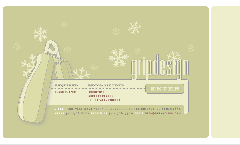

What attracts me to their website is the muted, natural colors that harmonize together on the page. It is not necessary to have so many bright and flashy colors to draw attention and keep it. If one can select the right colors to create a pleasing color palette, then that is what’s really important. Also, I appreciate how the web designer did not just stick to the angular, sharp cornered blocks of color we are so accustomed to seeing in amateur web design. Of course, this page was created in Flash, so that accounts for the freedom of form, but it still reflected in the small elements of the page- such as the customized scroll bars within the page content, the graphic buttons that serve as links, and the sensitivity to type selection, all of which are not your standard web elements. Underlined links, gray form buttons and default web fonts could have functioned just the same, but it just wouldn’t be as pleasing to the eye nor would it appeal to or reflect good design sensibility.
As far as user friendliness, the navigation system is not all organized in one place, like a navigation bar or a single drop down menu, instead the web designer decided to allow the user to use his intuition to follow a button, then a drop-down menu, then different types of buttons. At first one may construe this as confusing, but really, it engages the user to really explore the whole webpage, it exposes the user to all types of links, not just words that are underlined.

Within the page, a user can follow links to view the company’s portfolio which spans a multitude of media from web to identity to packaging and more. All of which reflect the company’s sensitivity to an unobtrusive type of design. It is not all flashy, but takes on a more sophisticated sensibility. All of the design lives harmoniously together, whether it be in print or electronic.
However, I am a little concerned that perhaps this type of design may be too “safe?” Maybe it does not take enough risks? That is what I am always worried about in my own design as well. I try to placate the design but that often results in being boring and too safe—something that works, but that we’ve already seen.
posted by Courtney at 2/20/2006 08:54:00 PM
![]()


2 Comments:
This flashsite is pretty interesting because it allows the user to navigate very easily through it. What I found to be very witty and well designed was the cell phone in the portfolio that had entertainment on it that allowed the user to navigate through a key pad. By pressing any of the buttons that are lit, you navigate the books' spreads from page to page, the turning of the pages in a attempt to digest the material. I really like the Frankey and johnny poster and the photo of the salt & pepper shakers is pretty witty, if you saw the movie you would understand. And Steppenwolf poster is pretty explicit and I like it because the photo is composed pretty well. The pain and the itch is very nice, I find the hand to be placed well within the frame, and I really like white space it allows the viewer to rest.
1:14 AM
I really like the simplicity and organization of the website. It has a good balance of providing the information that the viewer needs and looking attractive. The subtle colors and clean design communicate a sense of sophistication, professionalism, and confidence. You said that this site's navigation system might seem confusing but it engages the user to really explore the whole webpage. When I first went to this site it seemed like it would be very straight forward and easy to navigate through, but when I began looking around, I found myself slightly lost at some moments. However, overall, I was able to find my way around and i enjoyed "exploring." but I might have not enjoyed "exploring" so much if I just wanted to get the information quickly. My favorite parts of the website were the animated decorative circles and the animated buttons, such as the "contact/to map" arrow button. These little elements added a layer of fun to the website.
10:11 PM
Post a Comment
<< Home