Monday, January 30, 2006

[no. 004] Area / pg. 380- 383/ Chris Ware


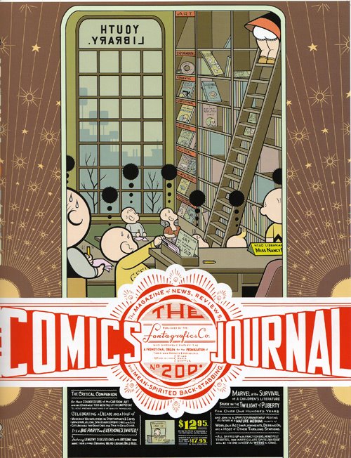
First of all, the book Area, published by Phaidon, is a very big book that is filled with lots of interesting design work. Chris Ware, from Chicago, has some visually appealing work in this book. Chris is actually a comic artist who “obsesses over unrepentantly luscious forms.” His illustrations are very geometric in form and cartoon-like in color. What particularly appeals to me is his use of space and scale. He utilizes the entire page to paint a well-designed canvas of lines, shapes, and typography. Especially in his “The Comics Journal” poster, the artwork, which we are able to discern without much effort, is very two-dimensional. However, the manner in which he places the typography over the drawn figures, with the smaller type below, makes this piece be perceived as if there is more than just one plane in space that each element is resting on. Not only that, but in the margins of the poster, there are very simple, yet eye-catching series of lines and circles that recede towards the title of the piece, moving our interest around the page from drawn figures to type to lines again.

In Ware’s “Building Story” and “Branford the Bee” comic strips, he makes use of scale to change up the expected squares of identical size that are typically used in comics. This method makes the comics seem more diagrammatic and dynamic than most other comic strips. In his “Building Story” strip, I like how the diagram like elements, like the connecting lines, close-ups, and icons relate to its content of building and breaking down a certain process.


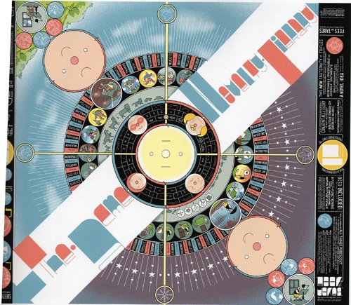
There is a certain quality to “The Acme Novelty Library” cover that reminds me of a record album cover. I think it is the radial shape that is created with the circles placed on a central axis point that first establishes this. But moreover, it is the compass-like crossbars, dial-like tick marks, roulette table compartments, and generally circular forms that emphasize this too. As a contrast to the colorful, complex center art, the margins of the cover are very simplified and monochromatic.


I like how Chris Ware is very aware of how he is using the spacial elements in his works, contrasting styles within the same piece to create visual interest. There are multiple levels to read into his work that make it something you have to look at closer and closer, pulling you into his comic world.

Sunday, January 22, 2006

[no. 003] Visual Research /chapter 2/ case study 3

While I was looking through Visual Research: An Introduction to Research Methodologies in Graphic Design, by Ian Noble and Russel Bestley, I came across a case study that caught my eye. In the book it is Case Study #3: I Love You, beginning on page 82. What drew me to it initially was just the multitude of small little icons that reminded me of Webdings or some other dingbat typeface that we see and can usually recognize, but rarely use. Then, upon reading into the article, I found out that it is from a designer named Wayne Daly who was “investigat[ing] the relationship between graphic design and human emotions.”

Daly researched the history and development of the heart symbol (like the one used in “I LOVE NY”) and how it has been applied to branding campaigns and corporate identities. I thought that the amount of research that went into the preliminary stages of Daly’s personal project were very impressive. He has 400 examples on the posters that attracted my attention, and I am sure that he had much more, but was forced to pare it down to these 400. This is a lesson to all of us as beginning designers, and better yet, as students in general. It is only through thorough research that will be able to create an impressive final. Though it seems like a waste of time to research in depth, it surely pays off in the end.


Reading further, the case study describes how Daly made these posters by categorized each symbol by their usage. For example, healthcare institutions, charitable organizations, political groups, pornography, and other distinctions that are not legible enough to read on the posters printed in the book. Unless I’m missing something in the reading, I think this may have been as far as Daly went in this particular facet of the project. So I was a little disappointed to discover that although I was attracted to these posters, they really had no depth to them. But this can also serve as a good lesson that I know Lee has told us time and again, that it is absolutely pointless if what you design is attractive, but provides no deeper layer of information.

Daly used his initial interest and some of that research, then expanded it to include lonely heart advertisements and electronic romance indicators. However, the culmination of his “graphic ephemera” in this entire project, was scanned into a computer, and then composed into a poster that “mark[ed] the overall scale of the project.”

Monday, January 16, 2006

[no. 002] Radical Type Design /chapter 4/visual poetry


      I recently received two out of the three assigned books for this past winter break, Radical Type Design and Visual Research. I was looking through the former, and came across some interesting type designs in the fourth chapter of the book, Visual Poetry.
      First of all, I found Susan Laporte’s design to be of interest because of the method she employed for her “Extended Families: Creating Typographic Hybrids”project in which she used the format of a family tree and filled it with two typefaces to create a third, the hybrid. This section describes Laporte’s three-step formula: generation one: identification; generation two: mutation; and generation three: hybridize. Not only was this a creative method of creating a new typeface, but I thought it was wonderful that she did so by hand, not just by plopping two typefaces of interest into a computer program and have it done automatically. By having it done by hand shows that there was particular care and concern given to the nuances of the parent typefaces in order to conceive of the child typeface.
      Secondly, I was interested by the geometric essence of Ahn Sang-Soo’s work. The first piece of work that caught my attention was the photograph of a gate, which is Sang-Soo’s, that is entirely filled with letterforms. I suppose I was initially drawn to the geometric forms that reminded me of Futura’s letterforms, but I now recognize that it is actually Korean characters that compose this gated wonder. It is actually quite amazing that a well-known typeface that was invented in America can seem to have such similar visual characteristics to that of another language. Perhaps the visual languages that people from various nations communicate by are more similar than they are different. As a side note, I would also like to add that it was refreshing to see typography that has jumped off the two-dimensional page and into the three-dimensional world that we can physically interact with.

Tuesday, January 10, 2006

[no. 001] THIS ONE'S FOR YOU LEE

okay lee, here's my blog page :D